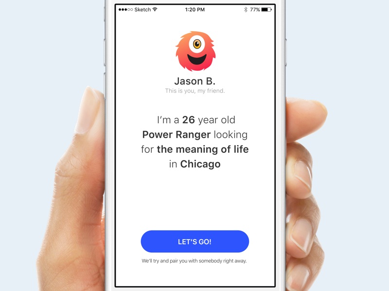
Mobile web forms are incredibly handy for anyone who has a smartphone and who wants to get things done right now. It’s a potentially unlimited market to tap into, so it helps to be ready with the right mobile web forms. Keep these tips in mind for better customer or user experiences when it comes to customizing the forms.
You Have the Power
Mobile forms are what you make of them, meaning you don’t just have to copy what you’ve already seen. Each form should be customized to a specific purpose, and there should be no question or field that feels superfluous to the user. Filling things out on a laptop with a comfortable keyboard is very different than having to key in a lot of information via their index finger. Those on mobile phones are already going to have a shorter tolerance for multiple fields. To get them to stick with it until the end, you need to use your voice and your thoughts to condense as much as possible.
Think It Through
The more you think like your customer, the more likely it is you’ll have an idea of what they need. Most people who are on a mobile are likely excited about whatever it is you’re offering. Whether that’s a deal, a new product, or a time-sensitive item like concert tickets, it’s a great time to capitalize off of their enthusiasm by giving people options. For example, some customers may not want to take the time to open a full account when they’re trying to get everything done from their mobile phone. If all you need from them is a credit card number and their name, then you don’t necessarily have to make them go through any further steps. It’s great to get people to sign up for a long-term service obviously, but sometimes the extra steps can make customers associate your company with a frustrating experience. Also, you should set up the form so that most of their information can be filled in from the saved information that’s already on their phone (e.g., address, etc) when possible.
Interact with the User
Forms need to tell those who are filling them out exactly what they need to do, including password requirements and user name specifications. If someone has to re-key in a password three times, they’re probably not going to want to keep going onto a fourth try. Give them an idea of what they need to do, and you’ll be more likely to see them come back in the future. If none of their information is saved for the next time they want to come back, they’re also likely to be disappointed. Mobile web forms may be the first and only takeaway a customer has from your business, so it helps to make the process as seamless as possible.


Comments